DE Analysis with Generalized Linear Models
Overview
Teaching: 30 min
Exercises: 50 minQuestions
How do I need to prepare my data for analysis in R?
What standard statistical methods do I need to analyze this data set?
What packages are available to me for biostatistical data analysis in R?
How do I perform advanced differential gene expression analysis using R packages?
Objectives
Become familiar with advanced statistical methods in R for quantifying transcriptomic gene expression data.
Gain hands-on experience and develop skills to be able to use R to visualize and investigate patterns in omics data.
Be able to install and load the necessary biostatistics R packages.
Be able to run functions from biostatistics packages for data analysis and visualization in R.
Advanced Statistical Analysis in R - Generalized Linear Models
With our transcript sequence data now aligned and quantified, we can also use generalized linear models (GLM). These are another classic edgeR method for analyzing RNA-seq expression data. In contrast to exact tests, GLMs allow for more general comparisons.
Note: GLMs are an extension of classical linear models to nonnormally distributed response data. GLMs specify probability distributions according to their mean-variance relationship.
Tip!
GLM’s may be used for general experiments with multiple factors, and parallels the ANOVA method. This is in contrast to the exact tests, which are only applicable to experiments with a single factor.
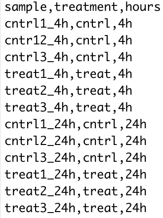
As usual, the types of comparisons you can make will depend on the design of your study. In our case:
| sample | treatment | hours |
|---|---|---|
| SRR8288561 | cntrl | 4h |
| SRR8288562 | cntrl | 4h |
| SRR8288563 | cntrl | 4h |
| SRR8288564 | treat | 4h |
| SRR8288557 | treat | 4h |
| SRR8288560 | treat | 4h |
| SRR8288558 | cntrl | 24h |
| SRR8288567 | cntrl | 24h |
| SRR8288568 | cntrl | 24h |
| SRR8288559 | treat | 24h |
| SRR8288565 | treat | 24h |
| SRR8288566 | treat | 24h |
Note in the treatment column:
- cntrl - control treatment
- treat - treatment of UV-B exposure
So, from the above experimental design layout that we can see that we have the ability to perform an ANOVA like tests using generalized linear models with the read count (gene expression) data.
After normalization of the raw gene counts we will perform genewise quasi-likelihood (QL) F-tests using GLMs in edgeR. These tests allow us to perform ANOVA like tests for differences in the means within and between our grouping factors.
The hypotheses we will be testing:
- the means of the treatment factor are equal
- the means of the hours factor are equal
- there is no interaction between the two factors
Note that, we choose to use QL F-tests over likelihood ratio tests (LRT) since it maintains the uncertainty in estimating the dispersion for each gene.
Tip!
Since we have a more complicated experimental design layout, we will be using a csv file to specify the design.
targets <- read.csv(file="groupingFactors.csv")The groupingFactors.csv file has the following layout.
We will use the edgeR library in R with the data frame of transcript sequence read counts from the previous step of the bioinformatics workflow.
Tip!
Remember to load the edgeR library before you attempt to use the following functions.
library("edgeR")
Before we proceed with conducting any analysis in R, we should set our working directory to the location of our data. Then, we need to import our data using the read.csv function.
# set the working directory
setwd("/YOUR/FILE/PATH/")

# import gene count data
tribolium_counts <- read.csv("TriboliumCounts.csv", row.names="X")
As a first step in the analysis, we need to setup the design matrix describing the experimental design layout of the study.
# setup a design matrix
group <- factor(paste(targets$treatment,targets$hours,sep="."))
The grouping factors need to be added as a column to our experimental design before we can create a DGE list object. Here we use paste and factor to combine the factors (treatment and hours) into one string (group) separated by a period for each sample.
# create DGE list object
list <- DGEList(counts=tribolium_counts,group=group)
colnames(list) <- rownames(targets)
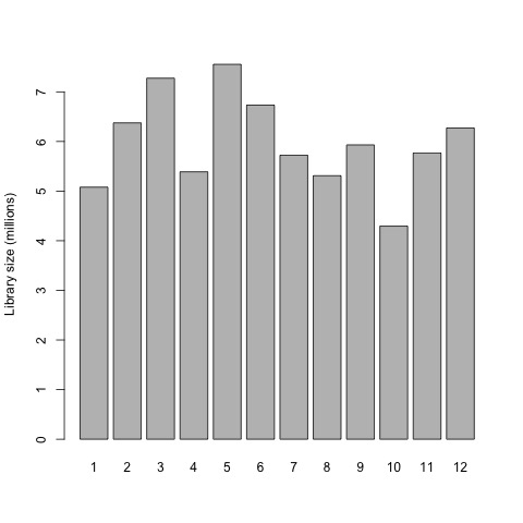
This is a good point to generate some interesting plots of our input data set before we begin preparing the raw gene counts for the exact test. So first, we will now plot the library sizes of our sequencing reads before normalization using the barplot function.
# plot the library sizes before normalization
barplot(list$samples$lib.size*1e-6, names=1:12, ylab="Library size (millions)")
Plot
Next, we need to filter the raw gene counts by expression levels and remove counts of lowly expressed genes.
#Retain genes only if it is expressed at a minimum level
keep <- filterByExpr(list)
summary(keep)
list <- list[keep, , keep.lib.sizes=FALSE]
The filtered raw counts are then normalized with calcNormFactors according to the weighted trimmed mean of M-values (TMM) to eliminate composition biases between libraries. The normalized gene counts are output in counts per million (CPM).
#Use TMM normalization to eliminate composition biases
# between libraries
list <- calcNormFactors(list)

#Retrieve normalized counts
normList <- cpm(list, normalized.lib.sizes=TRUE)

#Write the normalized counts to a file
write.table(normList, file="tribolium_normalizedCounts.csv", sep=",", row.names=TRUE)

#View normalization factors
list$samples
dim(list)
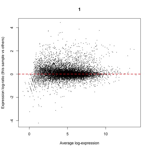
Now that we have normalized gene counts for our samples we should generate some informative plots of our normalized data. First, we can verify the TMM normalization with a mean difference (MD) plot of all log fold change (logFC) against average count size.
#Verify TMM normalization using a MD plot
plotMD(cpm(list, log=TRUE), column=1)
abline(h=0, col="red", lty=2, lwd=2)
Plot
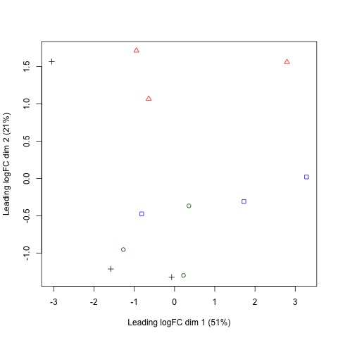
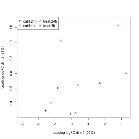
Next, we will use plotMDS to display the relative similarities of the samples and view the differences between the expression profiles of different samples.
Tips!
A few things to keep in mind:
- a legend is added to the top left corner of the plot by specifying “topleft” in the legend function. The location of the legend may be changed by updating the first argument of the function.
- the data frames of the points and colors will need to be updated if you have a different number of sample sets than in our example. These data frames are used to set the pch and col arguments of the plotMDS function.
#Use a MDS plot to visualizes the differences
# between the expression profiles of different samples
points <- c(0,1,2,3,15,16,17,18)
colors <- rep(c("blue", "darkgreen", "red", "black"), 2)

#Create plot without legend
plotMDS(list, col=colors[group], pch=points[group])

#Create plot with legend
plotMDS(list, col=colors[group], pch=points[group])
legend("topleft", legend=levels(group), pch=points, col=colors, ncol=2)
Plots
The design matrix for our data also needs to be specified before we can perform the F-tests. The experimental design is parametrized with a one-way layout and one coefficient is assigned to each group.
#The experimental design is parametrized with a one-way layout,
# where one coefficient is assigned to each group
design <- model.matrix(~ 0 + group)
colnames(design) <- levels(group)
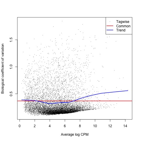
With the normalized gene counts and design matrix we can now generate the negative binomial (NB) dispersion estimates using the estimateDisp function. The NB dispersion estimates reflect the overall biological variability under the QL framework in edgeR. This allows us to use the plotBCV function to generate a genewise biological coefficient of variation (BCV) plot of dispersion estimates.
#Next, the NB dispersion is estimated
list <- estimateDisp(list, design, robust=TRUE)

#Visualize the dispersion estimates with a BCV plot
plotBCV(list)
Plot
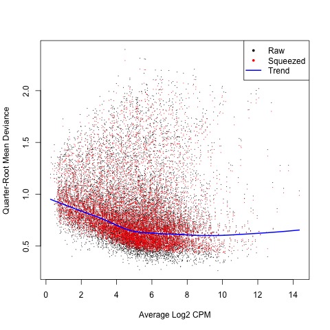
Next, we estimate the QL dispersions for all genes using the glmQLFit function. This detects the gene-specific variability above and below the overall level. The dispersion are then plotted with the plotQLDisp function.
#Now, estimate and plot the QL dispersions
fit <- glmQLFit(list, design, robust=TRUE)

#Create plot
plotQLDisp(fit)
Plot
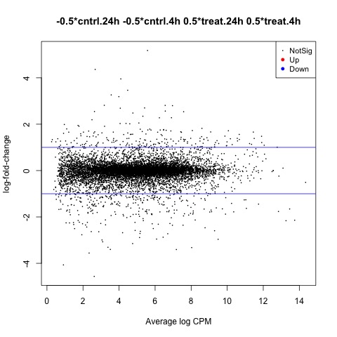
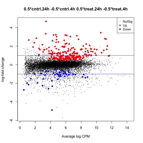
Now we are ready to begin defining and testing contrasts of our experimental design. The first comparison we will make is used to test our hypothesis that the means of the treatment factor are equal.
We can use the glmTreat function to filter out genes that have a low logFC and are therefore less significant to our analysis. In this example we will use a log2 FC cutoff of 1.2, since we see a relatively large number of DE genes from our test. The DE genes in our test are plotted using the plotMD function.
#Test whether the average across all cntrl groups is equal to the average across
#all treat groups, to examine the overall effect of treatment
con.treat_cntrl <- makeContrasts(set.treat_cntrl = (treat.4h + treat.24h)/2
                                                    - (cntrl.4h + cntrl.24h)/2,
                                                    levels=design)

#Look at genes with significant expression across all UV groups
anov.treat_cntrl <- glmTreat(fit, contrast=con.treat_cntrl, lfc=log2(1.2))
summary(decideTests(anov.treat_cntrl))

#Create MD plot of DE genes
plotMD(anov.treat_cntrl)
abline(h=c(-1, 1), col="blue")

#Generate table of DE genes
tagsTbl_treat_cntrl.filtered <- topTags(anov.treat_cntrl, n=nrow(anov.treat_cntrl$table), adjust.method="fdr")$table
write.table(tagsTbl_treat_cntrl.filtered, file="glm_treat_cntrl.csv", sep=",", row.names=TRUE)
Plot
The second comparison we will make is used to test our hypothesis that the means of the hours factor are equal.
#Test whether the average across all tolerant groups is equal to the average across
#all not tolerant groups, to examine the overall effect of tolerance
con.24h_4h <- makeContrasts(set.24h_4h = (cntrl.24h + treat.24h)/2
                                          - (cntrl.4h + treat.4h)/2,
                                          levels=design)

#Look at genes with significant expression across all UV groups
anov.24h_4h <- glmTreat(fit, contrast=con.24h_4h, lfc=log2(1.2))
summary(decideTests(anov.24h_4h))

#Create MD plot of DE genes
plotMD(anov.24h_4h)
abline(h=c(-1, 1), col="blue")

#Generate table of DE genes
tagsTbl_24h_4h.filtered <- topTags(anov.24h_4h, n=nrow(anov.24h_4h$table), adjust.method="fdr")$table
write.table(tagsTbl_24h_4h.filtered, file="glm_24h_4h.csv", sep=",", row.names=TRUE)
Plot
The final comparison we will make is to test our hypothesis that there is no interaction between the two factors (treatment and tolerance). To make our last contrast we will test whether the mean effects of the two factors are equal.
#Test whether there is an interaction effect
con.interaction <- makeContrasts(set.interaction = ((treat.4h + treat.24h)/2
                                                    - (cntrl.4h + cntrl.24h)/2)
                                                    - ((cntrl.24h + treat.24h)/2
                                                    - (cntrl.4h + treat.4h)/2),
                                                    levels=design)

#Look at genes with significant expression
anov.interaction <- glmTreat(fit, contrast=con.interaction, lfc=log2(1.2))
summary(decideTests(anov.interaction))

#Create MD plot of DE genes
plotMD(anov.interaction)
abline(h=c(-1, 1), col="blue")

#Generate table of DE genes
tagsTbl_inter.filtered <- topTags(anov.interaction, n=nrow(anov.interaction$table), adjust.method="fdr")$table
write.table(tagsTbl_inter.filtered, file="glm_interaction.csv", sep=",", row.names=TRUE)
Plot
Scripts for this Lesson
Here is the R script with the code from this lesson. Also included is a R script with the plots being written to jpg files, rather than output to the screen.
Key Points
The BiocManager is is a great tool for installing Bioconductor packages in R.
Make sure to use the ? symbol to check the documentation for most R functions.
Fragments of sequences from RNA sequencing may be mapped to a reference genome and quantified.
The edgeR manual has many good examples of differential expression analysis on different data sets.